Graphical Panel
Overview
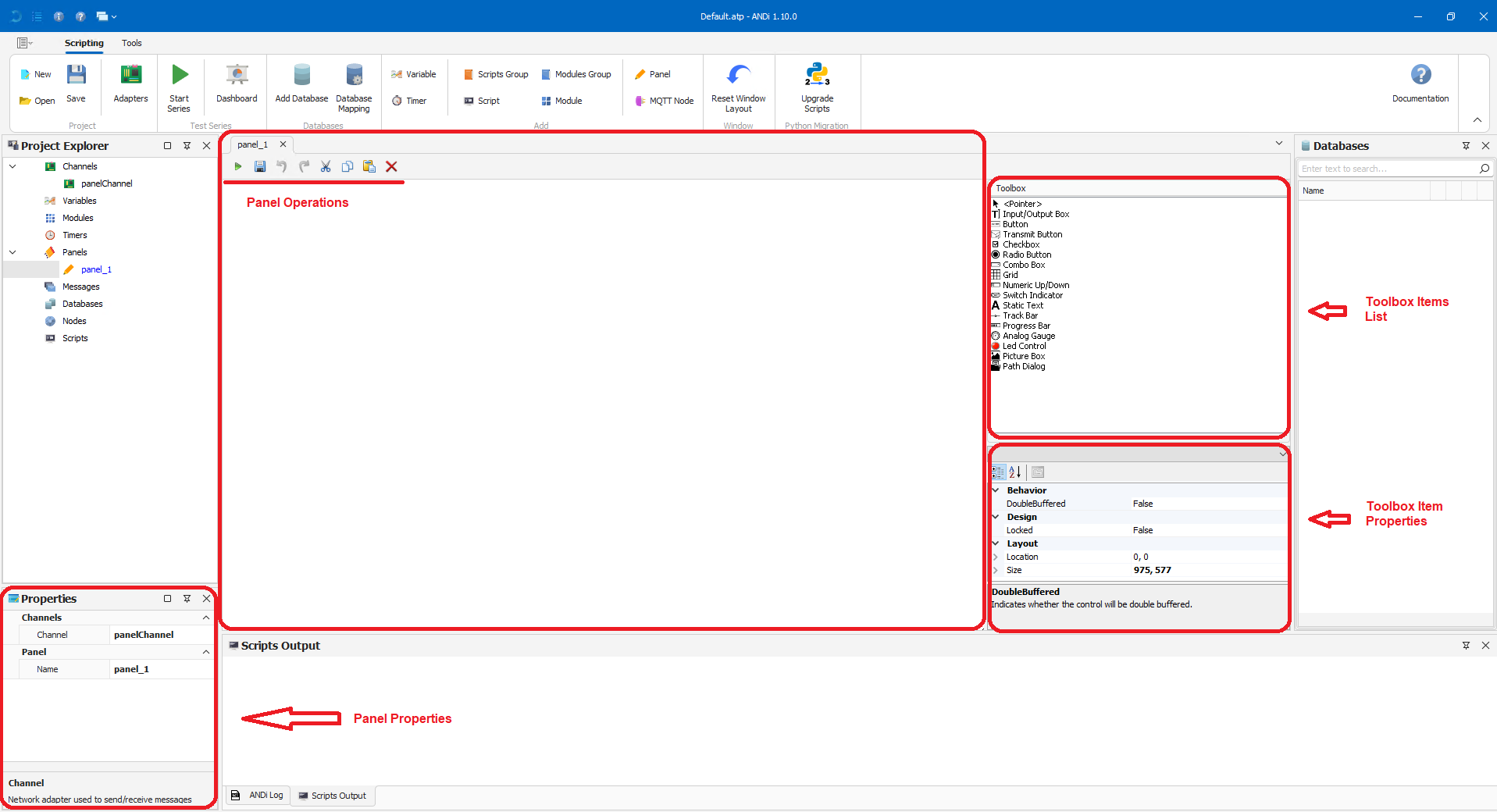
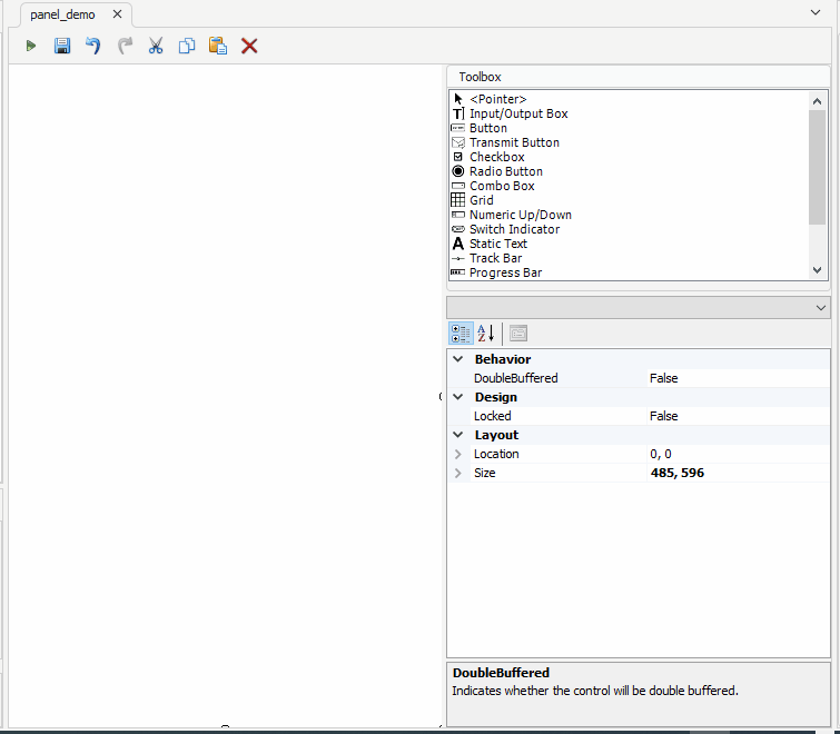
Panel Root Form it is the design surface where user can drag and drop toolbox items.
Panel Operations user can respectively run panel, save panel, undo last changes, redo undone changes, cut, copy, paste and delete toolbox item(s).
Panel Properties user can rename the panel or select an adapter on which the panel will be listening.
Toolbox Items List the list of supported toolbox items.
Toolbox Item Properties contains the properties of the selected toolbox item (or panel root form if none is selected).
Common Properties
Name
Indicates the name used to identify the toolbox item, it should be unique within the panel.
Locked
Determines if the toolbox item can be moved or resized with mouse.
Location
Sets the toolbox item's coordinates within the panel.
Size
Sets the size of the toolbox item in pixels.
Linked Symbol
Sets the Symbol linked to the toolbox item, could be a Signal, a Parameter, a Global Variable, an MQTT Topic, a Message or a Script.
Direction
Indicates whether the toolbox item is in read-only mode (Rx) or read/write mode (Tx).
ValueType
Specifies whether the physical value or raw data should be displayed. It has an effect only on Signal Symbols.
Note
Each toolbox item support specific Symbol types.
Toolbox Items
The toolbox contains different set of tools:
Pointer
The pointer is a passive toolbox item, it is useful when user need to deselect an already selected toolbox.
Supported Symbols: None.
Input/Output Box
When linked to a Symbol, it will display the Symbol name and its value.
Supported Symbols: Signal, Parameter, Global Variable and MQTT Topic.
Transmit Button
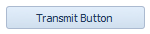
Transmit Button is used to trigger its linked Symbol when clicked.
Supported Symbols: Script and Message.
Checkbox
It will show checked status when the current value of the linked Symbol is equal to the checkbox's "Switch Value 'Checked'" property.
It will show unchecked status when the current value of the linked Symbol is equal to the checkbox's "Switch Value 'Unchecked'" property.
Otherwise it will show undetermined status.
Supported Symbols: Signal, Parameter, Global Variable and MQTT Topic.
Radio Button

It will show checked status if the current value of the linked Symbol is equal to the radio button's "Switch Value" property.
Otherwise it will show unchecked status.
Supported Symbols: Signal, Parameter, Global Variable and MQTT Topic.
Combo Box

It will contain the list of the linked Symbol's interpretations and show the interpretation equal to the Symbol's current value.
Supported Symbols: Signal, Parameter, and MQTT Topic.
Grid
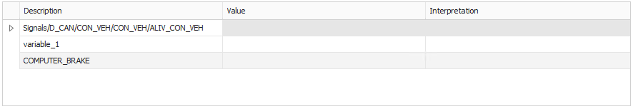
The grid contains a list of Symbols, each row contains one Symbol with its value and the corresponding interpretation.
Supported Symbols: Signal, Parameter, Global Variable and MQTT Topic.
Note
If the Symbol's current value does not have interpretation, it will show the Symbol's value under the interpretation column.
Signal Viewer
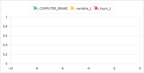
The chart contains a list of Symbols, Symbol's values will be drawn with the color displayed in the legend.
Supported Symbols: Signal, Parameter, Global Variable and MQTT Topic.
Note
Signal Viewer will display the numeric values received in the last N seconds with N = History Duration.
Numeric Up/Down

It will display its linked Symbol's numeric value.
Supported Symbols: Signal, Parameter, Global Variable and MQTT Topic.
Switch Indicator
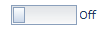
It will show On status if the current value of the linked Symbol is equal to the switch indicator's "Switch Value" property.
Otherwise it will show Off status.
Supported Symbols: Signal, Parameter, Global Variable and MQTT Topic.
Static Text

It will simply display the value of its "Text" property.
Supported Symbols: None.
Track Bar
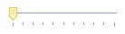
It will display its linked Symbol's numeric value.
Supported Symbols: Signal, Parameter, Global Variable and MQTT Topic.
Progress Bar
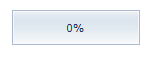
It will display its linked Symbol's numeric value.
Supported Symbols: Signal, Parameter, Global Variable and MQTT Topic.
Analog Gauge
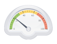
It will display its linked Symbol's numeric value.
Supported Symbols: Signal, Parameter, Global Variable and MQTT Topic.
Led Control

It will show Green Light if the current value of the linked Symbol is equal to the led control's "Switch Value" property.
Otherwise it will show Red Light.
Supported Symbols: Signal, Parameter, Global Variable and MQTT Topic.
Path Dialog
It will show its linked Symbol's value.
Supported Symbols: Global Variable.
Picture Box
Picture Box has an images list, each image is linked to a value.
The picture box will display the image linked to the current value of the linked symbol.
If no image linked to the current value, the default image will display.
If default image is not defined, picture box will display "No image linked to the current value".
Supported Symbols: Signal, Parameter, Global Variable and MQTT Topic.
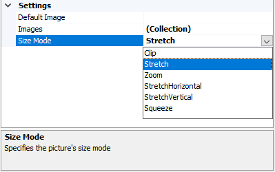
Settings
Default Image: Specifies the path of the image that will be displayed if there is no image linked to the current value of the linked symbol.
Images: The list of images an their linked values.
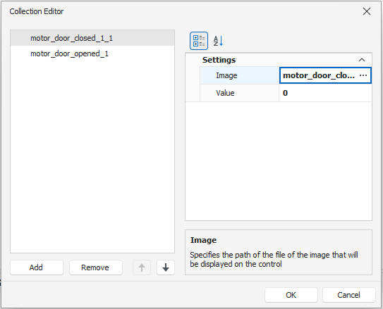
SizeMode: Specifies the picture's size mode.
Signal or Parameter Sources
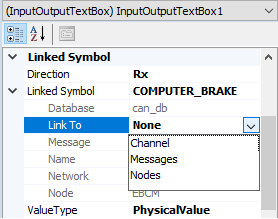
Channel
When linked to Channel, the toolbox item updates its value based on the linked symbol value received from the adapter.
Messages
Messages mean the list of messages in the scripting environment.
When the Symbol is a Signal and the Signal's parent Message is present in Messages, the toolbox item's value changes once the Signal's value changed.
Nodes
Nodes mean Rest Bus Simulation Nodes list in the scripting environment.
When the Symbol is a Signal and the Signal's parent Node is present in Nodes, the toolbox item's value changes once the Signal's value changed.
How To
Link a Symbol to a toolbox item
The toolbox item can have a Signal, a Parameter, a Global Variable or an MQTT Topic as a Symbol.
Signal as a Linked Symbol
To link a Signal to a toolbox item:
Drag and drop the toolbox item on the panel surface.
Select Signal from the Symbol property's drop down list.
Select a Signal in the opened pop-up.
Select a source from the Link To property's drop down list.
Parameter as a Linked Symbol
For more details, please refer to SOME/IP in Graphical Panel Tutorial.
Global Variable as a Linked Symbol
To link a Global Variable to a toolbox item:
Drag and drop the toolbox item on the panel surface.
Select Global Variable from the Symbol property's drop down list.
Select a Global Variable in the opened pop-up.
MQTT Topic as a Linked Symbol
To link an MQTT Topic to a toolbox item:
Drag and drop the toolbox item on the panel surface.
Select MQTT Topic from the Symbol property's drop down list.
Select an MQTT Topic in the opened pop-up.
Link Symbols to a Grid
Recipe
Grid.
Database.
Global Variable.
MQTT Node
Steps
Open the collection editor form the " Linked Symbols" property.
Add and configure Symbols.
Click "OK" button to confirm.
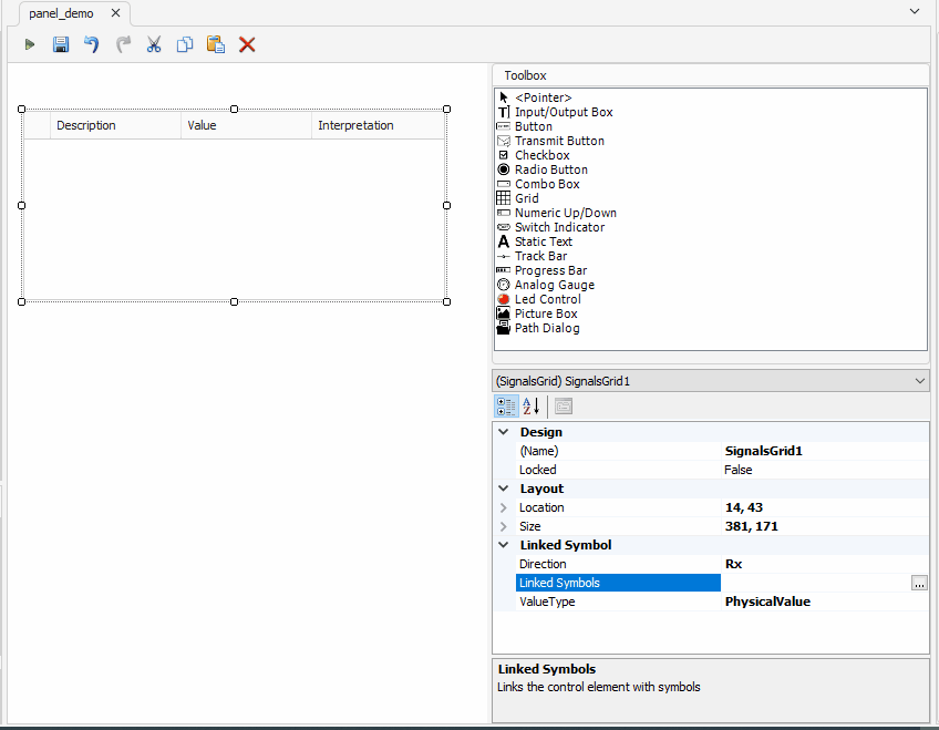
Not configured Symbols won't be added to the grid.
Visualize and update Linked Symbols
Recipe
2 Grids linked to the same Symbol.
Database.
Started RBS node with an activated Message (the Message containing the Signal in the grids).
Steps
In the first grid, change the source of the Signal Symbol to Nodes and the direction to Tx.
In the second grid, change only the source of the Signal Symbol to Nodes.
Run the panel.
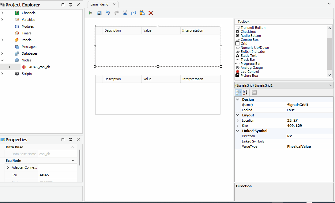
The other toolbox items present the same behavior.
The second grid is updated by the changes made in the first grid.
Trigger a Script from a panel
Recipe
A Script.
Steps
Link a Script to the Transmit Button.
Run the panel.
Trigger the Script by clicking the button.
Note
When triggering a Script, Transmit Button will remain checked until the Script is stopped.